Project 02
INBOUND SHIPPING LABEL
My Role: UI/UX, UX Research
Client: PWCC Marketplace
The CEO entrusted me with the responsibility of developing an inbound shipping label. The primary objective behind creating a dedicated shipping label at PWCC was to enhance the conversion rate of submissions. This was achieved through a discounted shipping label solution, empowering users to conveniently print the label from home and arrange a pickup or drop it off at USPS or FedEx offices.

Project Type: Web & Mobile
SHIPPING OVERVIEW
The purchase of a shipping label marks the third step in the submission process at PWCC.
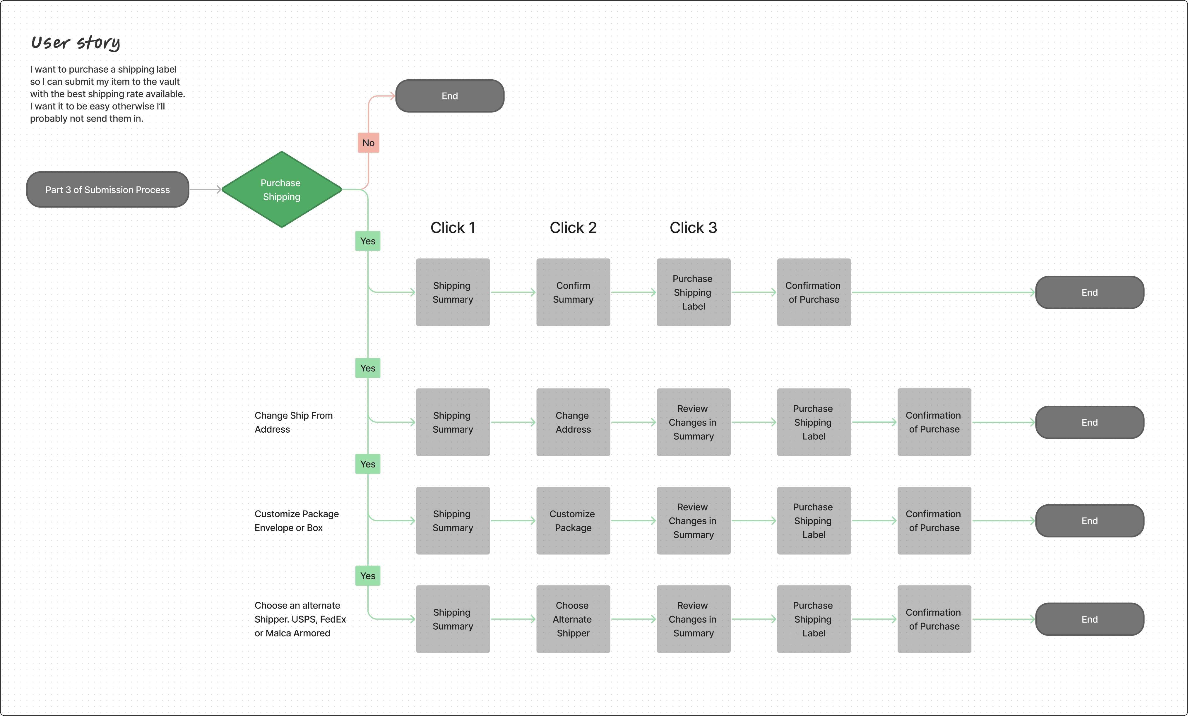
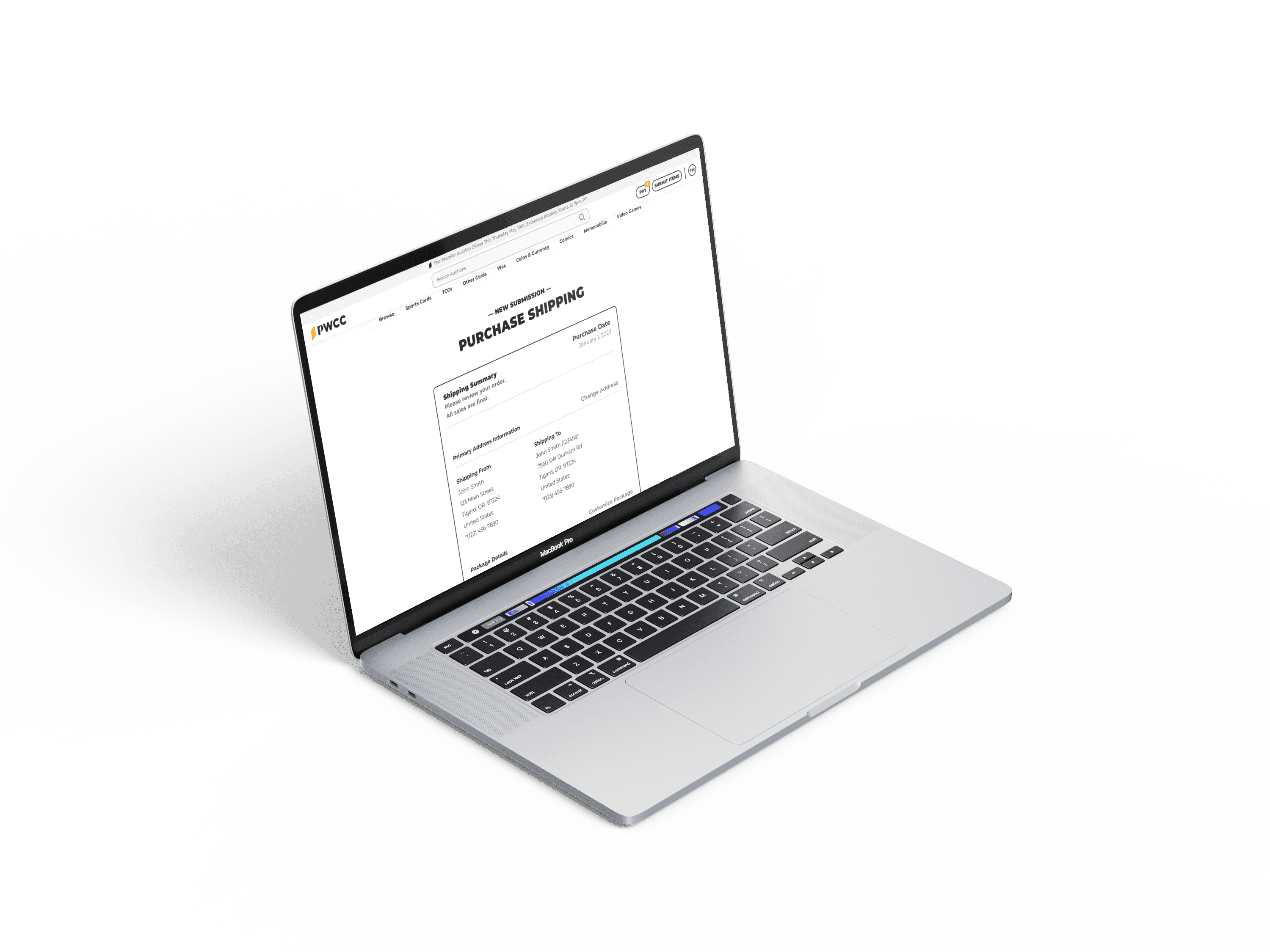
Upon opting to procure the shipping label through PWCC, all information provided in the preceding two steps is automatically retrieved to determine the most cost-effective shipping price accessible to the user. This shipping summary is generated by utilizing the shippers' APIs. If the user wishes to make alterations, they have the flexibility to customize various options before completing the final purchase.
INCREASED SUBMISSION CONVERSIONS
Acquire the optimal shipping label rate in just three simple clicks. Should the user prefer a different option, customization of shipping preferences is at their disposal. They can select between a box or an envelope and enhance USPS or FedEx choices. In the case of high-value items, users have the option to opt for Malca and coordinate armored transportation through our dedicated customer service.
Purchase shipping

Auto-Generated Summary

Pay with Credit Card

Purchase Confirmation

Customize shipping on summary page

Choose alternate shipping options

USPS Options

FedEx Options

DOING IT WRONG TO GET IT RIGHT
In my initial design flows, I intricately merged elements from the USPS and FedEx shipping processes to create a visually appealing but complex user experience. However, during a review meeting, I realized that I was overwhelming the users with an abundance of questions, potentially inducing analysis paralysis due to the multitude of options.
In my second version, I streamlined the process, yet the users still needed to navigate through several options to complete a purchase. This led me to rethink the approach entirely. During a discussion with a fellow design team member, an innovative idea emerged - reversing the process by presenting a summary upfront. This way, users would immediately see the best available rate, and if they wished to explore other options, the system was already primed for customization.
This fresh approach excited the CEO, injecting new enthusiasm into completing the final product.
Shipping Flow


Hindsight is 20/20
Ensure the availability of all team members at the project's outset to prevent potential build conflicts later in the process.


