Project 01

ITEM DETAIL REDESIGN

My Role: UI/UX, UX Research

Client: PWCC Marketplace

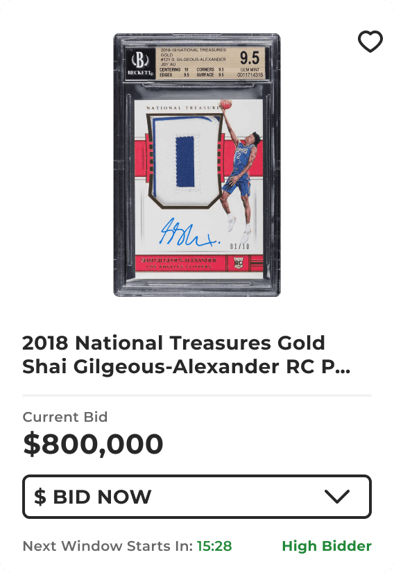
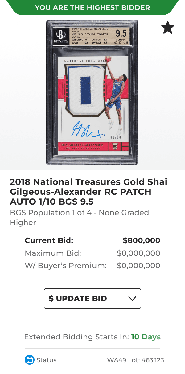
The VP of Product assigned me the responsibility of designing a new Item Card that aligns with our product vision and enhances the user experience. This initiative involves crafting a visually appealing and user-centric design, ensuring it seamlessly integrates with our existing platform.
Item Detail image
Item Detail image
Item Detail image

Project Type: Web & Mobile

Minimizing lost bids
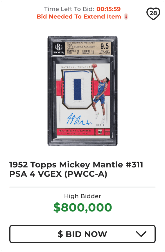
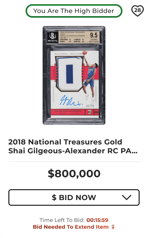
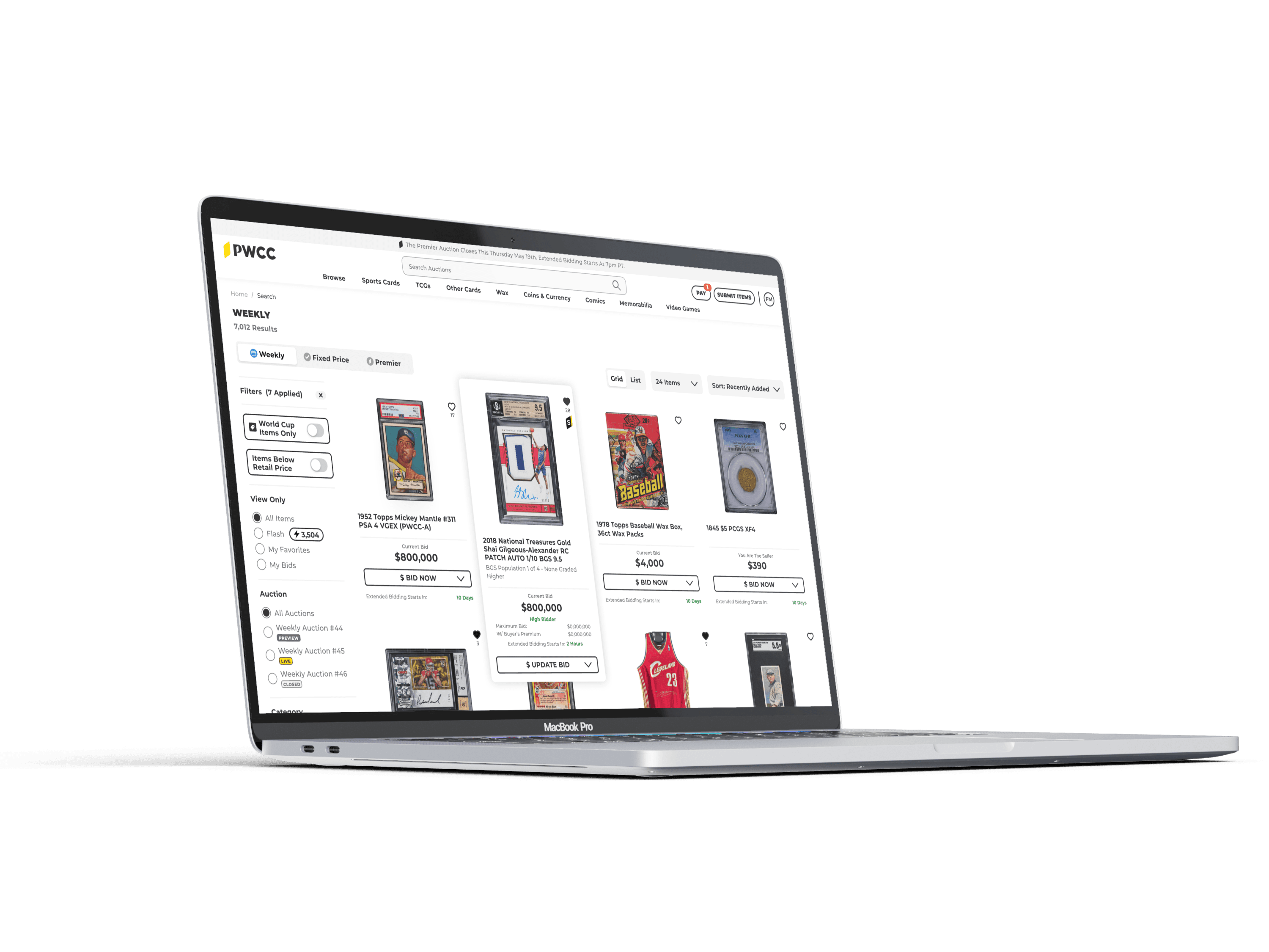
The redesigned UI enables users to swiftly view their items and place bids, addressing the need for speed during fast-paced auctions. By minimizing scroll time, the new interface resulted in a 3% reduction in lost bids during rapid bidding sessions.

The redesigned UI enables users to swiftly view their items and place bids, addressing the need for speed during fast-paced auctions. By minimizing scroll time, the new interface resulted in a 3% reduction in lost bids during rapid bidding sessions.

Detail Hover
Detail Hover
Detail Hover

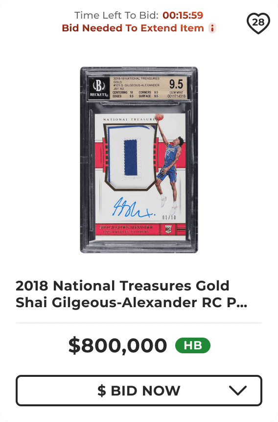
Detail: new card static state mockup

Detail Hover
Detail Hover
Detail Hover

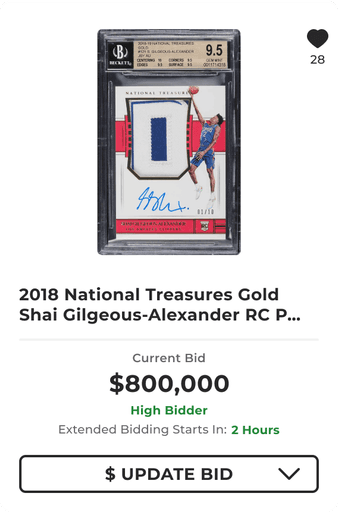
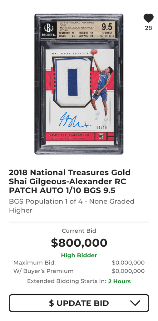
Detail: new card hover state mockup

OVERVIEW OF CARD DETAILS

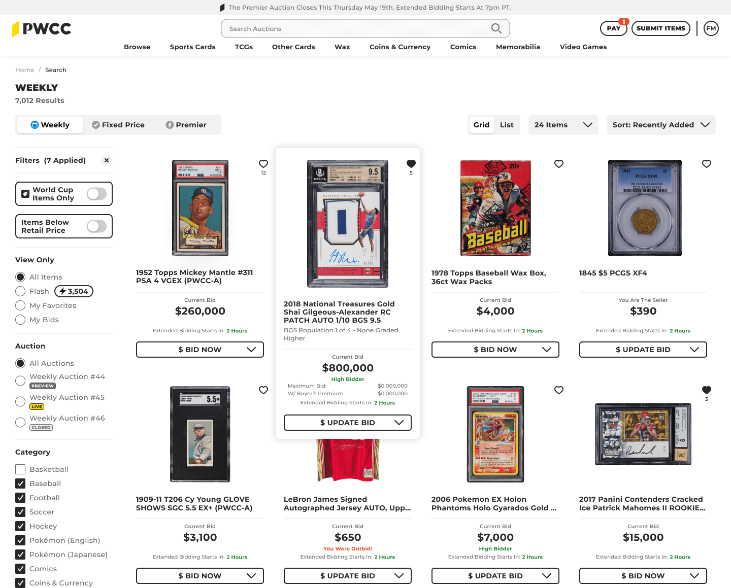
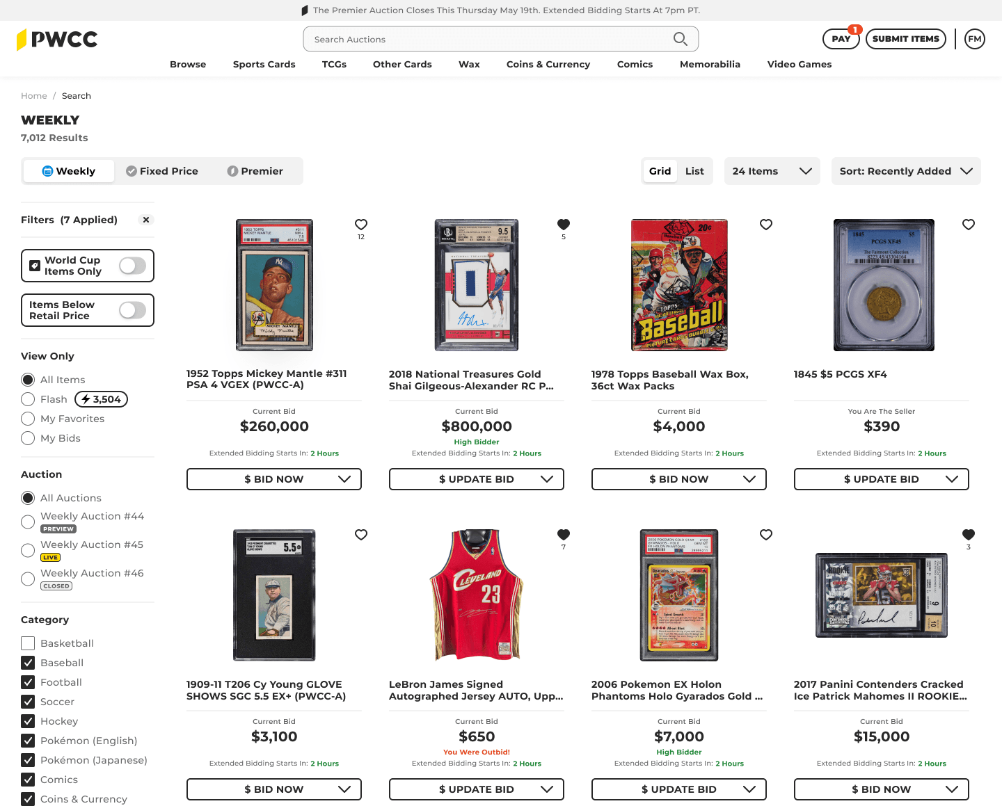
The initial item card design was created by developers. However, the key elements needed to be realigned to match the users' preferences and priorities. Those key elements are card title, price, and bid status.

Original Card

Original Item Card

Original Item Card

EARLY DESIGN IDEAS

EARLY DESIGN

IDEAS

These are a few design options that I presented to the team. These options had potential, but they either lacked the correct hierarchy, were overly colorful, appeared cluttered, or didn't guide the user's focus effectively.
Design 01
Design 01
Design 01
Design 02
Design 02
Design 02
Design 03
Design 03
Design 03
Design 04
Design 04
Design 04
Design 05
Design 05
Design 05
Design 06
Design 06
Design 06

BETTER UX FOR QUICKER BIDDING

BETTER UX

FOR QUICKER

BIDDING

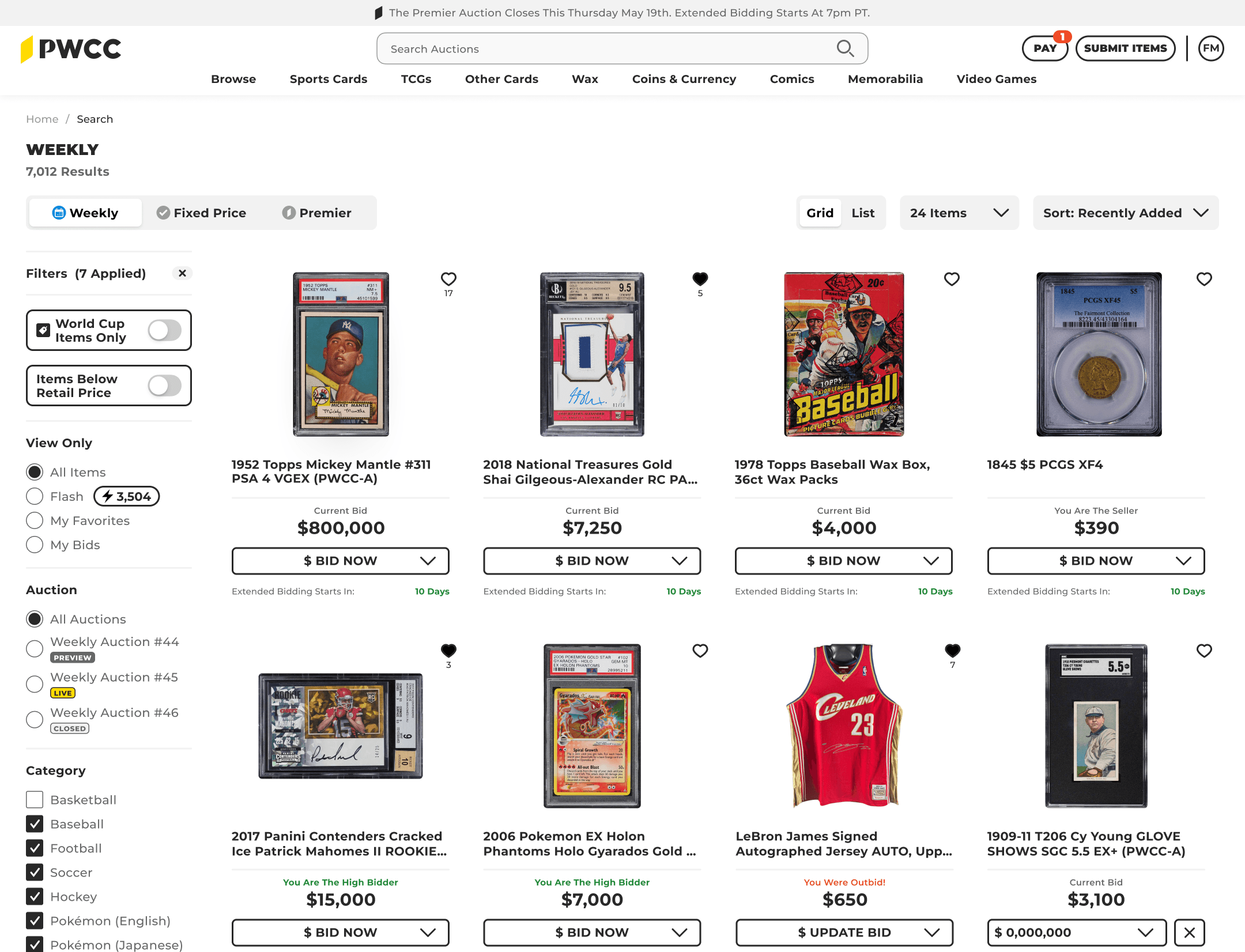
By amalgamating user testing, internal research, and Baymard Institute data, I gathered insights from a multitude of global websites, summarizing these findings in a comprehensive Product Requirement Document. While analyzing the original cards, I pinpointed essential elements crucial for a user aiming to make a purchase - the card title, price, and bid status. Moreover, I found that displaying supplementary information in the Hover state proved to be highly effective. Incorporating these insights into both Static and Hover states enhanced the user experience. Increased card visibility per page and a notable 26% boost in page engagement.

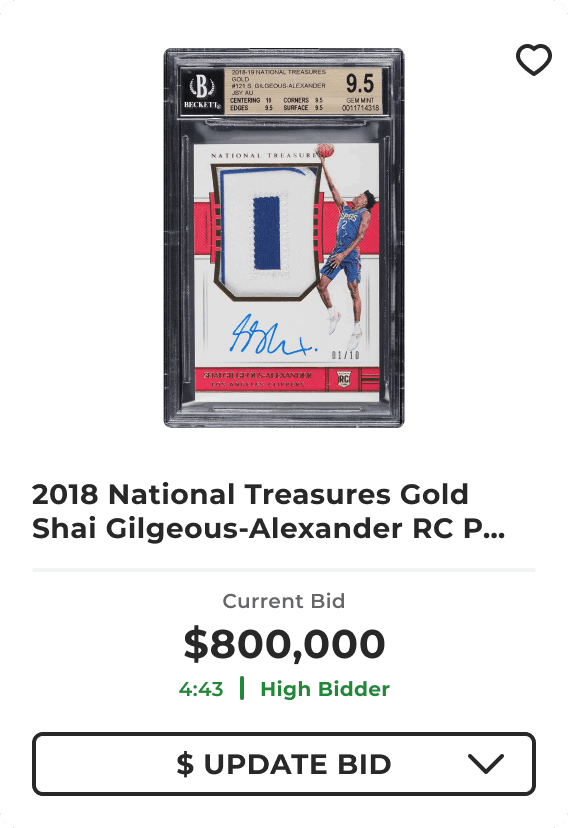
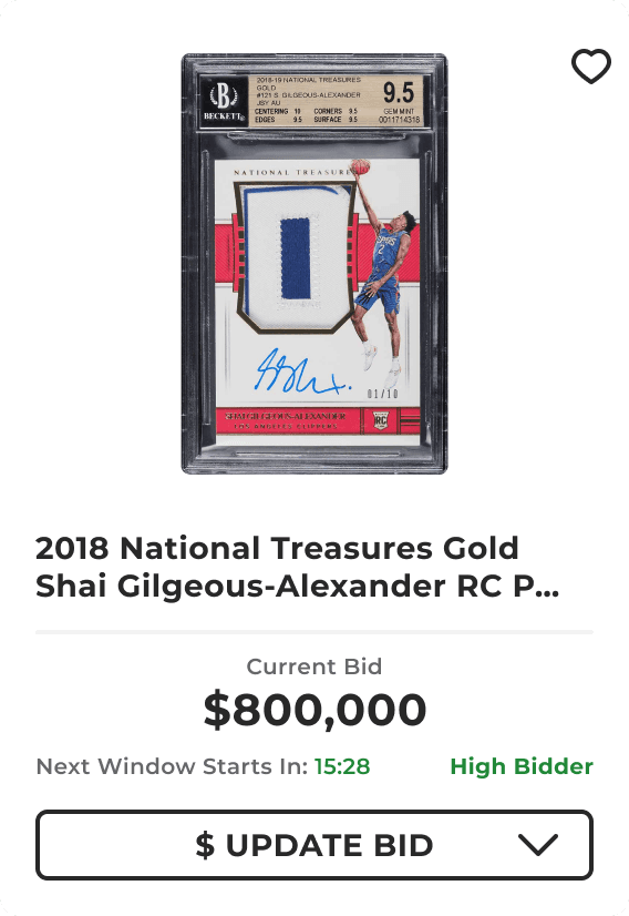
By amalgamating user testing, internal research, and Baymard Institute data, I gathered insights from a multitude of global websites, summarizing these findings in a comprehensive Product Requirement Document. While analyzing the original cards, I pinpointed essential elements crucial for a user aiming to make a purchase - the card title, price, and bid status. Moreover, I found that displaying supplementary information in the Hover state proved to be highly effective.

Incorporating these insights into both Static and Hover states enhanced the user experience. allowing for increased card visibility per page and a notable 26% boost in page engagement.

Static Card
Static Card
Static Card

NEW Static State

NEW Static State

Hover Card
Hover Card
Hover Card

NEW Hover State

Looking back.

This project served as a valuable reminder of the significance of integrating use-cases and personas, conducting thorough user testing, and fostering collaboration with developers throughout the research process.
Challenges:
Though not an active bidder on cards myself, I collaborated with the Head of QA and a Lead Developer to review all potential card states in an auction. We conducted multiple test auctions to ensure the designs matched current auction bidding states. During this process, we identified obsolete states from the original designs and updated a few others.


Lessons:
Inadequate onboarding can impede project progress. It's crucial to ensure that everyone involved in the project understands the intricacies of the bidding process.


HI-FIDELITY PROTOTYPE

HI-FIDELITY PROTOTYPE

Laptop View
Laptop View
Laptop View
Up Next

A WEB APP THAT INCREASES SUBMISSION CONVERSIONS RATES

Up Next

A WEB APP THAT INCREASES SUBMISSION CONVERSIONS RATES

Up Next

A WEB APP THAT INCREASES SUBMISSION CONVERSIONS RATES